The Hope Six Demolition Project, PJ Harvey (Island Records 2016)
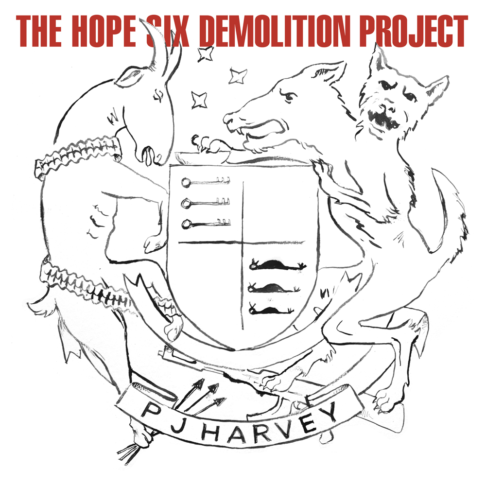 The Hope Six Demolition Project | PJ Harvey (Island Records 2016)
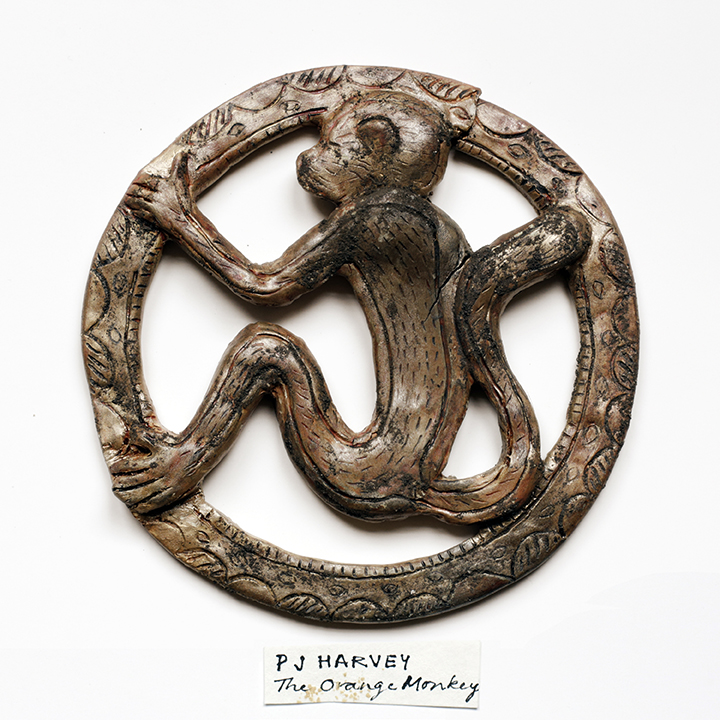 The Orange Monkey (packshot/ single) | PJ Harvey (Island Records 2016)
 Community of Hope (packshot/ single) | PJ Harvey (Island Records 2016)
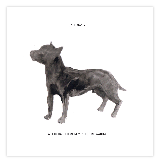 A Dog Called Money / I'll Be Waiting (vinyl single) | PJ Harvey (Island Records 2017)
 Guilty (packshot/ single) | PJ Harvey (Island Records 2017)
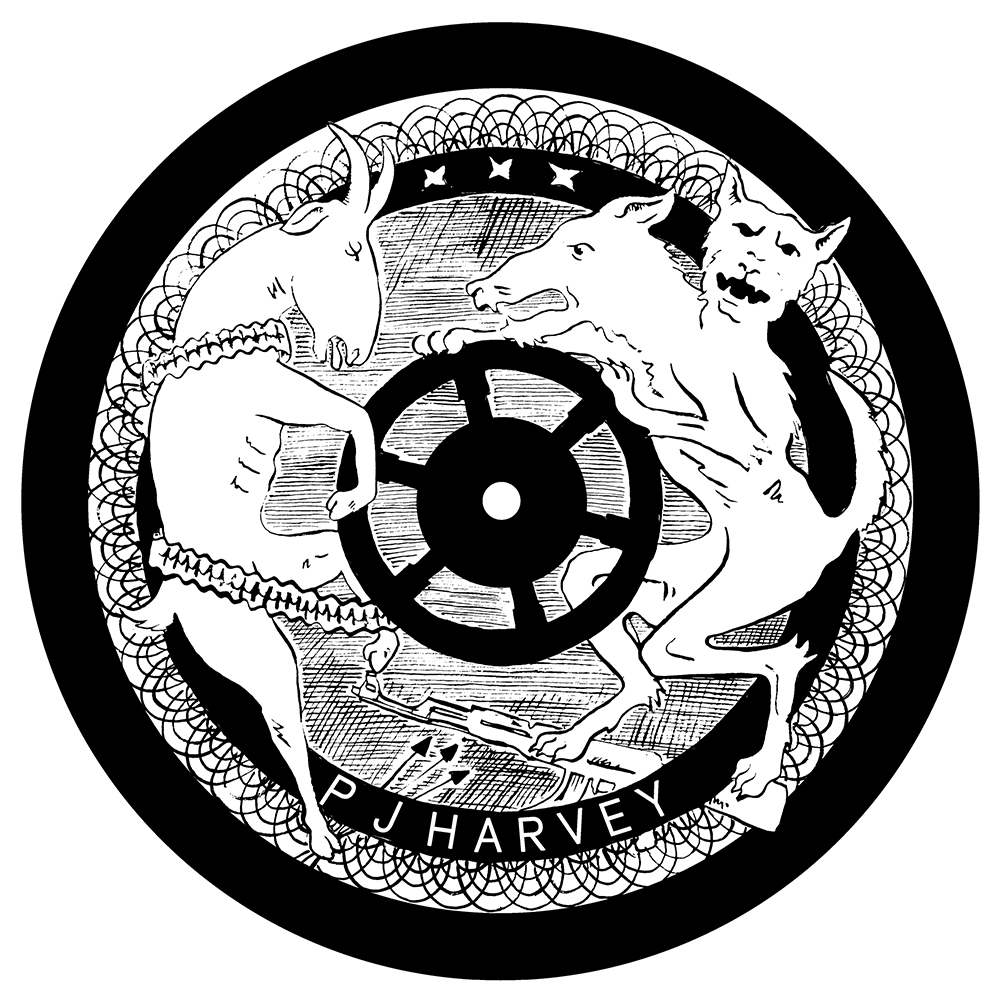 The Wheel (etched vinyl single) | PJ Harvey (Island Records 2016)
 Community of Hope Vinyl Etch | PJ Harvey (Island Records 2016)
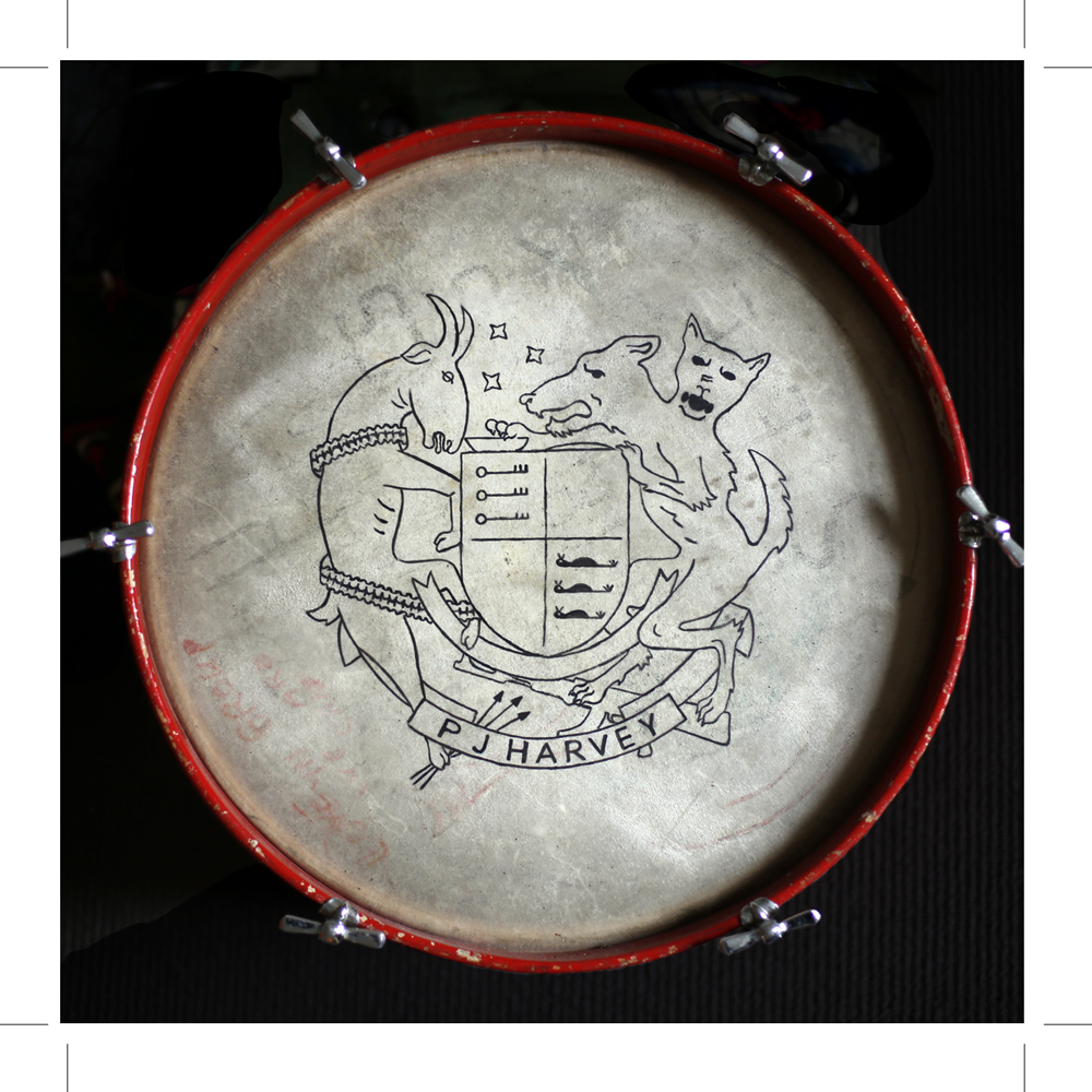
 Centre label of Hope Six vinyl | PJ Harvey (Island Records 2016)
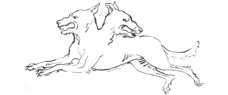
 Artwork from Hope Six CD | PJ Harvey (Island Records 2016)
 Artwork from Hope Six CD | PJ Harvey (Island Records 2016)
 Artwork from Hope Six CD | PJ Harvey (Island Records 2016)
 Download Card Design for The Hope Six Demolition Project | PJ Harvey (Island Records 2016)
Site designed and built by Michelle Henning.